May 7, 2026
de·cide
decisionmatrix.com
Building de·cide: A Minimal Decision Matrix Tool
There's a particular kind of paralysis that comes with too many good options. You've probably felt it — staring at a list of apartments, job offers, or side project ideas, knowing that all of them have merit but unable to commit. Gut feeling gets you so far. Beyond that, you need a framework.
That's the premise behind de·cide: a lightweight, static decision matrix builder designed to bring structured clarity to personal decisions, with no backend, no account, and no friction.
What Is a Decision Matrix?
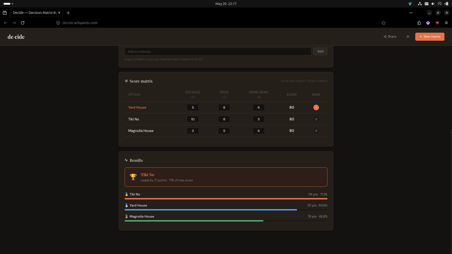
A decision matrix is a scoring tool. You list your options (e.g. Apartment A, Apartment B) and your criteria (e.g. Price, Commute, Natural light). Each criterion gets a weight — a number representing how much it matters relative to the others. Then you score each option against each criterion, and the weighted totals reveal a ranked order.
It sounds clinical, but in practice it's liberating. The process of building the matrix forces you to articulate what you actually care about, and the ranked result often confirms a preference you already held — or challenges one you hadn't examined.
Design Philosophy
The goal from the start was: true utility, minimal interface, zero cognitive overhead.
That meant a few firm constraints:
- No backend. A static site means no server to maintain, no database to breach, no accounts to create. State lives in the URL hash — the entire matrix encodes into a base64 string you can copy, share, and bookmark.
- No build step. Plain HTML, CSS, and JavaScript. Deployable to any static host in seconds.
- No noise. Every UI element earns its place. No modals, no onboarding flows, no tooltips that get in the way.
The aesthetic is editorial-minimal — Playfair Display for headings, DM Sans for body text, a warm off-white ground, and a terracotta accent that draws the eye to what matters.
Core Features
Weighted Criteria
Each criterion carries a weight from 1–10, set via a range slider. A score of 8 on a criterion weighted at 10 contributes far more to the total than the same score on a criterion weighted at 2. This single mechanic is what separates a decision matrix from a simple pros-and-cons list.
Live Ranked Results
As soon as you enter scores, the results panel updates in real time. A winner card highlights the top option, shows the margin over the runner-up, and displays the percentage of maximum possible score. Bar charts rank every option visually so relative gaps are immediately readable.
Shareable URL
The entire matrix state — question, options, criteria, weights, and scores — serializes into a base64-encoded JSON blob appended to the URL hash. Clicking Share copies that URL to the clipboard. Opening it restores the matrix exactly. No server involved.
PNG Export
Using html2canvas, the matrix and results panels render off-screen at 2× resolution and download as a PNG. Useful for dropping into a shared doc, a group chat, or a personal archive.
Dark Mode
Theme preference persists via localStorage. The palette shifts to a deep slate ground with warm-tinted surfaces — comfortable for evening sessions without sacrificing the visual hierarchy.
Making It Mobile-Friendly
The initial build was desktop-first, and mobile exposed several overflow problems that needed deliberate fixes rather than quick patches.
The header was the first casualty on small screens. Four buttons with text labels and icons simply don't fit at 375px. The solution: wrap all button labels in .btn-label spans and hide them at the 600px breakpoint. Icons carry the meaning; tooltips provide the fallback. The New matrix button got a + icon added specifically so it reads clearly in icon-only form.
The add-input rows were set to display: flex horizontally, which caused the text input to compress or overflow at narrow widths. On mobile they stack vertically — input takes full width, button sits below it at full width. Clean, tappable, no overflow.
Criteria tags posed a different problem. On desktop they sit as variable-width pills in a wrapping flex row. On mobile, any tag wider than the container caused horizontal scroll. The fix: stretch them to width: 100% at the breakpoint, and let the weight slider grow with flex: 1 to fill the available space.
The score matrix is inherently tabular — it can't collapse gracefully without losing its meaning. Rather than fighting that, the table scrolls horizontally within a overflow-x: auto container. The key addition: the option name column is position: sticky; left: 0, so it stays pinned as the user scrolls right across criteria columns. Score inputs shrink to 40px wide to fit more columns in the viewport. -webkit-overflow-scrolling: touch ensures smooth momentum scrolling on iOS.
These aren't heroic solutions — they're disciplined ones. Mobile-friendliness on a data-heavy tool comes from accepting the constraints of the medium and designing within them, not from trying to cram a desktop layout into a narrower box.
Technical Overview
| Concern | Approach |
|---|---|
| State persistence | Base64-encoded JSON in URL hash |
| Theme persistence | localStorage |
| Export | html2canvas at 2× scale |
| Fonts | Google Fonts (Playfair Display, DM Sans) |
| Dependencies | html2canvas only — no frameworks |
| Hosting | Any static host (Netlify, GitHub Pages, Cloudflare Pages) |
The JavaScript is vanilla and organized around a single state object. All mutations go through pure functions (addOption, removeCriterion, updateScore, etc.) that call render() to sync the DOM. No virtual DOM, no reactivity system — just deliberate, readable state management.
What's Next
A few directions worth exploring:
- Multiple saved matrices — using
localStorageto keep a library of past decisions - Tie-breaking notes — a freetext field per option for qualitative reasoning alongside the scores
- Criteria templates — presets for common decision types (apartments, job offers, tech stack choices) to reduce setup friction
- Collaborative mode — multiple scorers submitting independently, results averaged